September 24, 2026
30 Reasons Your Website Looks Vibe-Coded
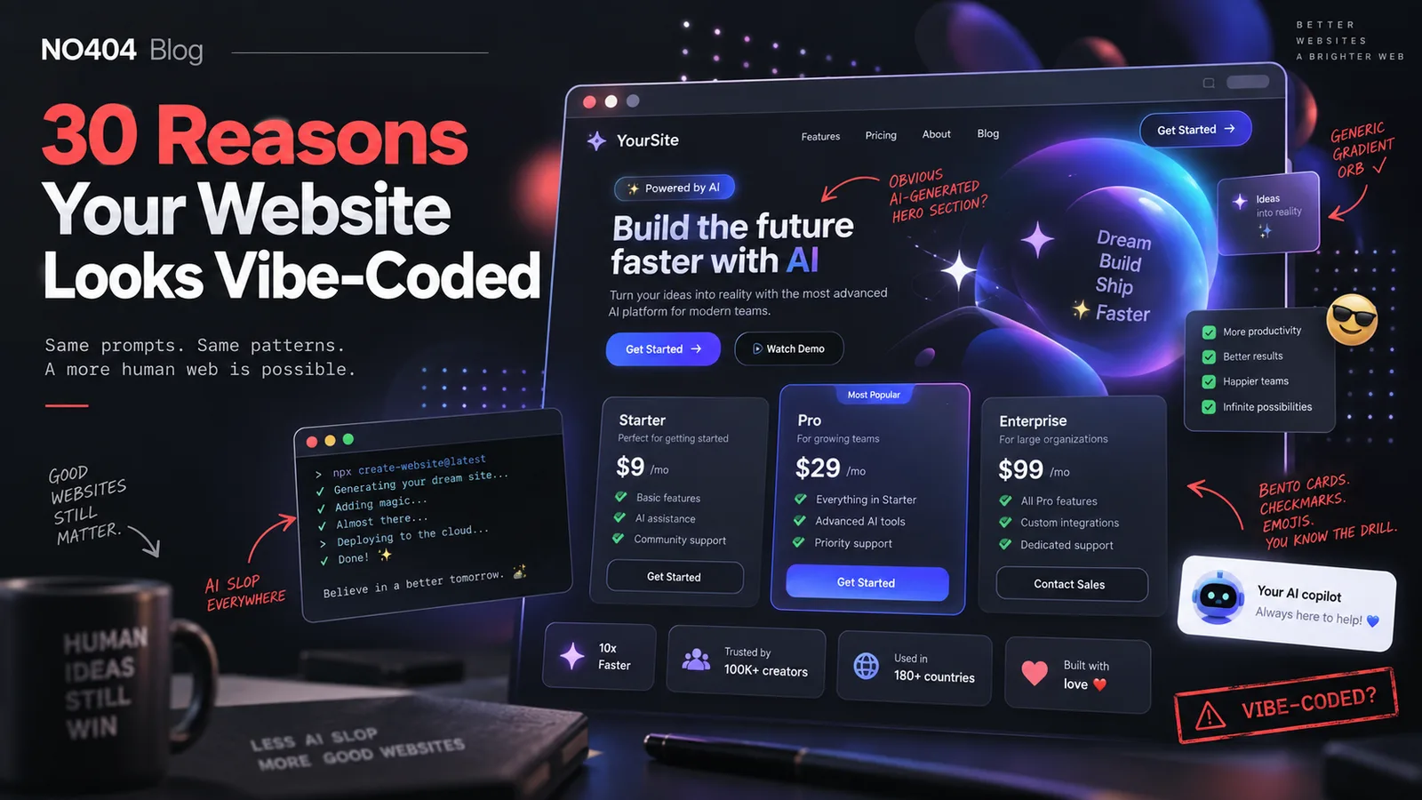
AI-assisted development has made it incredibly easy to build a polished-looking website in a few hours.
That is also becoming the problem.
A growing number of websites now share the same visual patterns, copywriting formulas, components, animations, and even technical shortcuts. You can often tell within seconds that a landing page was generated or heavily influenced by tools like Claude, ChatGPT, Cursor, Lovable, Bolt, or similar AI coding workflows.
There is nothing inherently wrong with vibe coding.
The problem starts when you ship the first AI-generated design without giving it a second design, UX, content, accessibility, performance, or technical review.
Here are 30 signs that your website might look a little too vibe-coded.
1. Harsh gradients
Large blue-to-purple, orange-to-pink, or neon gradients have become one of the fastest ways to make an interface look AI-generated.
Gradients are not bad.
The problem is using them everywhere without a visual hierarchy or a clear reason.
A strong visual identity usually uses gradients intentionally rather than as the default background for every hero section, button, card, and CTA.
2. Lucide icons everywhere
Lucide is an excellent icon library.
But because so many AI-generated React, Next.js, and Tailwind projects default to Lucide, using the same icons in every section can immediately make a website feel templated.
Use icons when they communicate information.
Do not add an icon next to every heading simply because there is space for one.
3. Pure white backgrounds
#FFFFFF everywhere can make a design feel unfinished.
Real-world interfaces often use slightly warmer or cooler surface colors, layered backgrounds, borders, or subtle contrast between sections.
Even something as simple as separating the page background from card surfaces can make the interface feel much more intentional.
4. Rainbow coloring
Blue feature.
Purple feature.
Green feature.
Orange feature.
Pink feature.
AI-generated landing pages love assigning a different color to every product benefit.
Unless those colors communicate actual meaning, they usually create visual noise rather than hierarchy.
5. Drop shadows on everything
Cards, buttons, navigation bars, pricing blocks, screenshots, modals, badges.
If every object floats, nothing feels important.
Good interface design uses elevation selectively.
Sometimes a simple border or change in background color communicates hierarchy better than another box-shadow.
6. Three feature cards in a row
You have probably seen this section:
Three equally sized cards.
An icon.
A short heading.
Two sentences.
AI tools generate this structure constantly because it is safe, responsive, and easy to implement.
There is nothing technically wrong with it, but repeating the pattern several times makes a website feel generic.
7. Emojis as product design
Emojis can work in informal products and community-focused interfaces.
But replacing proper illustrations, icons, product screenshots, or visual systems with random 🚀 ✨ 🔥 💡 emojis often makes a product feel unfinished.
Especially when the rest of the brand is trying to look professional.
8. Liquid glass everywhere
Blurred translucent panels, glassmorphism, giant backdrop filters, glossy cards, and transparent navigation bars can look impressive in screenshots.
They can also become distracting, difficult to read, and expensive to render.
Use glass effects as an accent, not as the entire design system.
9. Em dashes everywhere
This one is about copywriting.
AI models love the em dash — sometimes a little too much.
When every second paragraph uses one, the writing starts to sound synthetic.
Good copy varies sentence structure.
10. Inter, Geist, or Space Grotesk
All three are good fonts.
That is exactly why they appear everywhere.
Using Inter, Geist, or Space Grotesk does not automatically make a site vibe-coded, but combining them with every other pattern in this article certainly strengthens the effect.
Typography should be part of your brand identity, not simply the default choice from your starter template.
11. Colored left stripes
A card with a gray background and a blue, purple, green, or orange border on the left has become another common AI-generated component.
It works well for alerts and categorized information.
Using it repeatedly for regular content makes the pattern lose meaning.
12. Fake testimonials
“Sarah M., Founder”
“This completely transformed our workflow.”
“10x better than anything we used before.”
Do not invent testimonials to fill empty landing-page space.
Fake social proof is worse than having no social proof at all.
If you do not have customers yet, show the product, explain the problem, publish benchmarks, provide a demo, or simply say you are early.
13. Bento grids
Bento layouts became popular because they allow several product capabilities to be demonstrated within one attractive section.
Then everybody started using them.
A bento grid can still work, but it should reflect the structure of your product instead of being used simply because it looks modern.
14. Fake terminal windows
Another classic developer-product pattern:
$ npm install amazing-product
✓ magic complete
Terminal interfaces are useful when your users genuinely interact with your product through a CLI, SDK, package manager, or API.
Otherwise, they are often just decoration.
15. “It’s not X, it’s Y”
“It’s not analytics. It’s intelligence.”
“It’s not a tool. It’s your growth engine.”
“It’s not software. It’s a revolution.”
This formula has been used so frequently by AI copywriters that it now instantly feels generated.
Say what the product actually does instead.
16. Checkmark bullets
✓ Fast
✓ Secure
✓ Powerful
✓ Easy to use
Checkmarks can communicate included features effectively.
But using them for vague marketing claims adds almost no information.
Replace generic benefits with measurable capabilities.
For example:
“Processes up to 10,000 URLs per scan” is more useful than “✓ Powerful.”
17. Exactly three pricing tiers
Starter.
Pro.
Enterprise.
There is a reason this structure is popular: it works.
But pricing should reflect actual customer segments and product economics, not a SaaS landing-page template.
If your business needs two plans, use two.
If it needs four, use four.
18. No real product demos
This is one of the biggest problems.
The landing page looks beautiful, but nobody can see the actual product.
No screenshots.
No interactive demo.
No video.
No live example.
No dashboard preview.
Your product UI is often stronger proof than another paragraph of marketing copy.
Show it.
19. Soft corner radius everywhere
rounded-xl.
rounded-2xl.
rounded-3xl.
Modern frontend frameworks make rounded interfaces incredibly easy to build.
But if your navbar, hero, cards, buttons, screenshots, pricing tables, badges, inputs, and footer all have the same soft corners, everything starts to blend together.
Vary shape intentionally.
20. Purple and black
Dark background.
Purple glow.
White text.
Gradient CTA.
Congratulations: you have created approximately 40% of AI SaaS landing pages.
Purple and black can look excellent.
Just make sure they are part of an actual brand system rather than the default “AI startup” theme.
21. No skeleton loaders
AI-generated frontend demos often focus heavily on the ideal state.
Real applications need loading states.
A page that suddenly jumps from empty space to fully rendered content feels incomplete.
Skeleton loaders, progressive rendering, optimistic updates, and meaningful loading indicators are part of product design too.
22. Radial orbs
Large blurred circles positioned behind the hero section have become almost mandatory in generated SaaS designs.
Usually something like:
filter: blur(120px);
opacity: 0.4;
Use atmospheric effects carefully.
If every section has glowing blobs in the background, they stop adding depth and start adding noise.
23. Dot grids
Tiny background dots.
Usually behind the hero.
Usually fading toward the edges.
Another perfectly acceptable design element that became recognizable because of overuse.
Texture should support the brand, not substitute for one.
24. Sparkle icons
The sparkle icon has become visual shorthand for:
AI.
Magic.
Automation.
Smart features.
Sometimes it is appropriate.
But putting sparkles next to every AI-powered capability does not explain what the feature actually does.
25. Animated arrows
Bouncing arrows.
Rotating arrows.
Curved SVG arrows.
“Look here” arrows.
Animation should help users understand interaction or state.
If the arrow exists only to create movement, question whether it needs to be there.
26. No Terms of Service
A beautiful product with no Terms of Service page immediately feels less complete.
Especially for SaaS products handling accounts, payments, APIs, user-generated content, or business data.
Legal pages are part of shipping a real product.
27. No Privacy Policy
The same applies to privacy.
If your application processes analytics, authentication information, cookies, email addresses, user accounts, or other personal data, your privacy policy should not be an afterthought.
Trust is part of UX.
28. Hover animations on everything
Cards move upward.
Buttons scale.
Images zoom.
Icons rotate.
Borders glow.
Hover states are useful because they communicate interactivity.
But if every element reacts dramatically to the cursor, the interface becomes noisy and exhausting.
29. Neon colors
Neon green, electric purple, cyber blue, glowing pink.
These colors can support certain brands extremely well.
The problem is using them simply to make a product look “tech.”
Your color palette should represent the personality of the brand, not the industry stereotype.
30. Basic pastel colors
The opposite extreme exists too.
Soft lavender.
Soft blue.
Soft green.
Soft peach.
Combine them with rounded cards, Lucide icons, Inter, and a bento grid and you have another recognizable AI-generated aesthetic.
Pastels are not bad.
Predictability is.
The real problem is not vibe coding
Vibe coding is not the enemy.
AI can dramatically accelerate prototyping, frontend development, copywriting, debugging, and experimentation.
The real problem is treating the first generated result as the finished product.
AI is very good at producing patterns that already work.
That is exactly why those patterns start to look identical when thousands of people ship them unchanged.
Use AI for the first 80%.
Then spend time on the remaining 20%:
your brand,
your product,
your users,
your edge cases,
your loading states,
your accessibility,
your content,
your performance,
and your technical details.
That final 20% is usually what makes a website feel like a real product instead of a generated template.
And do not forget what happens outside the homepage
There is another sign of a rushed AI-built website that is much less visible than purple gradients or rounded cards:
broken URLs.
AI-assisted development moves quickly.
Routes change.
Pages get renamed.
Generated landing pages disappear.
Product URLs change.
Old blog posts are removed.
Marketing campaigns continue linking to routes that no longer exist.
And eventually users and search engines start reaching 404 Not Found pages.
A polished homepage does not help much when traffic lands on a dead end.
That is why, before shipping, you should also test:
internal links
deleted pages
old URLs
redirect chains
incorrect status codes
soft 404 pages
backlinks pointing to missing pages
Design quality matters.
But so does what happens when something breaks.
That is exactly the problem we are working on at No404: detecting broken traffic, understanding where it should go, and helping websites recover traffic that would otherwise disappear into a 404 page.
Before shipping your next vibe-coded website, review the design.
Then review the URLs too.